Most people think about colors, images, logos and layouts when we talk about “design”? However, typography is a major and often overlooked part of the design process.
Whether you are creating a website, new branding, an app, or the content you publish on social media, the copy must be clear, legible and its style should represent your brand. Typography tends to be mostly invisible to users when it works well, but you will quickly lose a user if the text is bad.
You can learn more about how to choose the right font for your brand in another article but here we will get into more detail about the rights and wrongs of effective typography.
#1. Typography basics
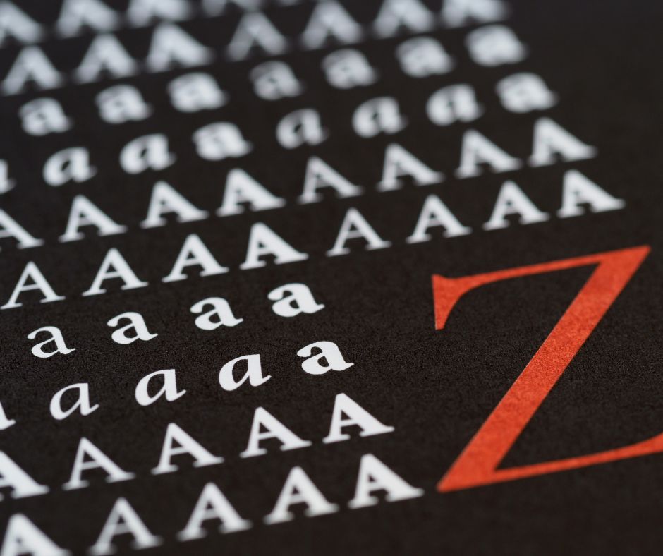
Do you know what sans serif means? Or what display typeface refers to? If you don’t, it may be time to study the basics of typeface classifications. This means learning about such elements as the hierarchy of the page, the relative legibility (on paper or onscreen) of various fonts, and how techniques such as tracking, kerning or leading affect each typeface.
This will help determine what kind of fonts you need for each project, as well as how to use them in a harmonious design.
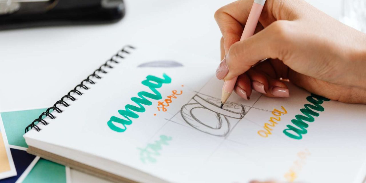
#2. Choose different typogarphy fonts or weights
This is a must for any web design project. Using the same typography style in the different elements of your website can make it look crowded and the content harder to follow.
For headlines, you should use a larger font with more weight or use a display typeface. Display types are suitable for short and large texts that need to stand out. This makes them a great option for ads, billboards or website headings.
For the subtitles and body, you can use fonts that are smaller in size, with less weight and more legibility. Since the text in subheadings and body is more abundant, the type needs to be easy on the eye so people can read the content easily.
#3. Look for new typefaces online
The Internet is full of websites and resources where you can find new typefaces that you can download for free or by paying a fee or subscription. If you are planning to design your own typeface, such websites can give you ideas, show you how they compare and demonstrate how they could make users feel. Are they easy to read? Do they create certain associations?
#4. Be minimal
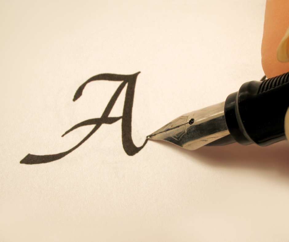
In practice, there are many things to take into account. Kerning, leading and tracking are concepts that a web designer needs to master in order to create a brand-new typeface. How will the letters fit together in words or on a line? How do they appear in bold or as italics? Such things are important considerations before the content is uploaded.
Creativity is clearly important, but effective typography needs to facilitate optical balance so it’s easier to read. This means that the text needs to have a clear hierarchy, the typography needs to be consistent, have a good use of contrast and space and, of course, be minimal.
#5. Use font superfamilies
If you don’t have time to design a whole ensemble of fonts for your website, you can always resort to superfamilies.
According to Google Fonts, a superfamily is defined as “the collective grouping of several explicitly related type families—such as a serif, sans, and slab—that all share the same underlying structure to their design.”
Font superfamilies include several typefaces, as well as different colors and font styles that can be combined in multiple ways without creating clumsy and visually unappealing results.
For this reason, they can be a great option for those who are in the early stages of a web development project and need a group of fonts to create web mock-ups and prototypes, or for small businesses who may not have all the necessary design resources to create a font family.
#6. Adapt your typography to mobile use
While this article is mostly about typography in the context of desktop websites, it’s important to note that mobile web can be a totally different story. Space is reduced on mobile screens, so less text may appear and will need to be more legible. Font sizes may need to be bigger and therefore designs will change. Essentially, what works for desktop might not work for mobile.
An associated concern with mobile is that links are big enough so people can see them and click on them. There should be a good use of negative space and margins, while the headlines cannot be as large as they might be on desktop.
#7. Use color intelligently
Introducing color in typography can be a little complicated, especially since we’ve stressed the importance of minimalism and clear design. If used well, color can be a great way to perfectly express the message you want to convey without sacrificing readability and functionality.
First of all, you need to find the colors that will serve specific purposes, such as using a specific color for headings and the body text. In this case, the most used colors are part of a neutral palette, using contrast to make the text legible. This very website applies the same technique, using dark gray text against a white background.
You can also use accent colors to make certain text stand out. For example, you can see on this page that links are colored in purple so readers know exactly where to click.
Your specific brand will also affect the choice of colors or hues used in your website. To know more about the psychology of colors in marketing, we recommend this article.
Typography – the conclusion
Typography can make or break a website. That’s why our last tip is to never stop learning! Trends come and go, but it pays to keep an eye on new ways of using typography in your design strategy while still relying on the basics to take your typography to the next level.


