
No matter how much you work on your eCommerce, it will be very hard for you to sell anything if your mobile checkout is bad. That is where the magic happens – where users become actual customers. It’s therefore essential to get the mobile-first design of your checkout right.
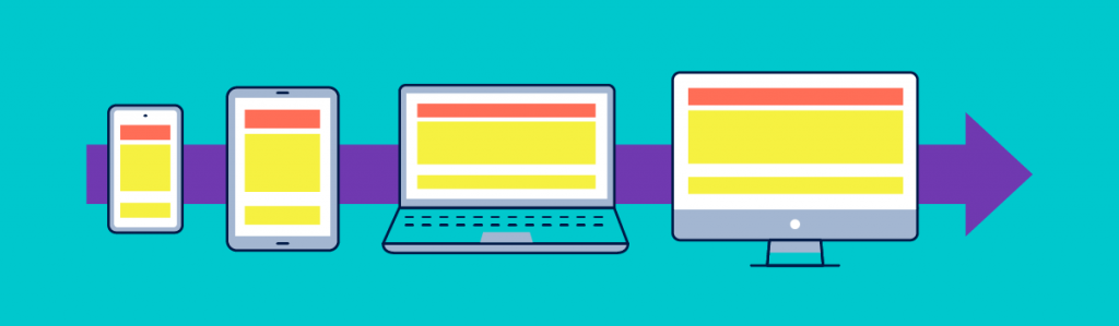
Mobile-first design
Mobile-first design means building your site for mobile before working on a desktop version. Most web traffic is mobile nowadays so it makes sense to focus primarily on mobile. If you plan your website for desktop first, you’ll have to cut half of your ideas to make the site mobile-friendly – so it’s better to do it the other way round.
Mobile checkout is still an issue
According to some studies, over 25% of users abandon the site during the checkout process. Why? The purchase intent is there, the decision has already been made, but shoppers suddenly decide not to buy.
A few years ago, this could have been linked to security concerns and to navigation or usability issues. Security concerns are not really a problem anymore, but design is.
Optimizing the shopping cart
Online shops have been working hard to solve issues such as unclear product details and difficulty in comparing products, navigation or getting information, but there are still wrinkles. The route to the checkout may flow smoothly, but what happens when customers start adding products to the cart? The option of keeping a hundred tabs open is not available here. That’s why you should try to reduce every process to the minimum number of steps.
The mobile-first shopping cart
Here is a list of checkout elements that you should definitely work on to increase conversions:
- Product name, price, photo and details for double-checking
- Ability to remove, save for later, and change details of the products
- Show the total price, individual prices and shipping charges
- Show the estimated date of delivery and give users the chance to change it
- Offer the possibility of choosing a pick-up location
- Include a call to action
Save for later or make a wishlist
Users frequently check the same products on more than one app or mobile website. They also sometimes add products to carts and think about whether to finalize the purchase later depending on factors such as their monthly budget. In this sense, there are always aspects outside our control that could affect the process. That’s why the “Save for later” button should be one of your best friends.
Giving users the option to save items for later reduces cart abandonment and allows customers to get back to their purchase when they are ready to buy the product. Having to locate the products again mostly forces users to use desktop to complete the purchase, which is neither practical nor effective.
When you give users the chance to save products or make a wishlist from the very beginning, they will more often finish the process they started. Creating wishlists further allows you to set up a series of alerts that pushes customers toward the purchase.
Delivery address form
No one likes filling in long forms. It’s boring, time-consuming and gives users innumerable chances to make mistakes that could be hard to detect. Here is how mobile-first design solves the problem:
- Use a limited number of input fields
- put clear labels above the input fields
- Use asterisks to indicate required fields
- Display the right keyboard for each type of input
- The shipping address should be the default billing address, but with an option to add another one
- Automatically advance fields when completed
- Use auto-suggestion, auto-detection and address lookup
Mobile-first for guest users
Not everyone wants to log in. Maybe users have landed on your store for the first time but have not yet become frequent customers. In this case, it is very convenient and quick to have a guest purchase option. However, studies prove that over 60% of users find it difficult to identify the guest checkout option – that’s 60% of people who want to buy from you but possibly can’t. If you give users what they want, they will be happy to return to your store. This is the easiest way to transform users into customers.
The ability to double-check
Mobile-first design establishes a very clear hierarchy to organize information in a way that makes the checkout much easier.
- User details and shipping address. There should be an option to edit these fields.
- Product details and number of items with “remove” and “save for later” options.
- Detailed price with taxes and shipping charges. Show any discount options.
- Auto-apply rewards and coupons. This needs to be very obvious to encourage users to keep buying and earning rewards
Easy payment and multiple options

People don’t like giving their credit card details to buy things online. Mobile conversion rates are higher when users can pay with options such as Paypal. Compare the experience of entering a lot of data, writing your full name, the number of your credit card, expiration date, etc. with just logging in into Paypal and confirming your purchase.
You should offer a few, recognizable, trustworthy and clear payment options. Also, use icons and badges to remind users that the transactions are secure.
If your customers have previously used credit cards, give them the option to use the same card again for convenience.
Confirm the purchase
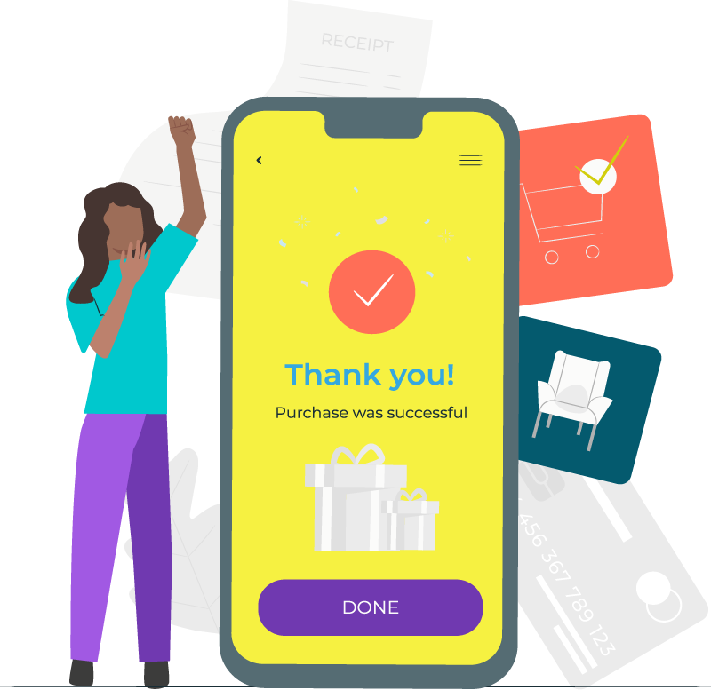
Let customers know that their transactions were successful by displaying a message and sending them an e-mail. Also:
- Summarize what they bought.
- Confirm payment AND payment method.
- Give users the chance to ask last-minute questions.
- Share a link to follow the shipping process.
- Close the process with a CTA that keeps users engaged.
Mobile-first design: the effort will pay off
If your e-commerce was perfectly designed for a flawless website experience, the shift to a mobile-first design might seem like a huge undertaking. Also, if this is your first attempt to launch an online store, there is a lot to digest. However, the effort will pay off.
Mobile-first design is very logical. Think of it as an investment. The more you work on an easy, simple, mobile-first design, the easier it will be for your business to adapt, change and scale.
What is mobile-first design?
Mobile usage is increasing and most of the traffic nowadays comes from mobile devices. That’s why mobile-first design refers to the idea of designing your site for mobile devices before desktop.
Why is mobile-first design important?
Having a mobile-focused design can be crucial to improve the mobile check-out process. The main reason why 25% of users abandon the site during this process is because of poor mobile design.


